use the following search parameters to narrow your results:
e.g. subreddit:pics site:imgur.com dog
subreddit:pics site:imgur.com dog
advanced search: by author, sub...
~2 users here now
It's All Politics
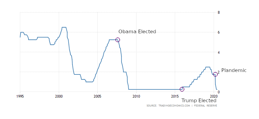
The impartial Federal Reserve. There are some other fun dates in there for you.
submitted 3 years ago by [deleted] from files.catbox.moe
view the rest of the comments →
[–]jmichaelhudsondotnet 2 insightful - 1 fun2 insightful - 0 fun3 insightful - 0 fun3 insightful - 1 fun - 3 years ago (0 children)
this graph could use a little more x/y axis description, the y axis representes the "stimulus" and "quantitative easing" asset purchases right?
view the rest of the comments →
[–]jmichaelhudsondotnet 2 insightful - 1 fun2 insightful - 0 fun3 insightful - 0 fun3 insightful - 1 fun - (0 children)