 other subredditsAntiExtremes
It rhymed with reddit, it tells people they can have their say, and the URL was available. So that's why we went with it. Sayit.net and sayit.com aren't available for purchase.
The logo certainly has a retro feel to it but i agree about the font. The Blade Runner font is cool if you are going for that look.
I would keep it as SaidIt - keep it simple.
As for lasers, they can add some zizz to a background, check out this collage I made a while back:
https://sierrakilobravo.files.wordpress.com/2014/11/tourists.jpg?w=640&h=523
Will you also register similar domains like "Seddit"?
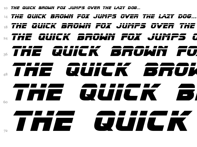
Good idea with the blade runner font, like this: http://fontzzz.com/fonts/sect36/blade_runner/img/waterfall_BLADRMF_.TTF.png
That would be cool. I like your lasers, I was thinking like this kinda: https://i.pinimg.com/736x/5b/2e/b7/5b2eb71bb8cb2b0eb70fb1a4a0254d52--vaporwave-art-s-aesthetic.jpg
We probably won't register seddit domains, both seddit.com and .net are already taken. I think just saidit.net. We're trying to keep costs down too.
Wow man LOVE the landscape lasers in that pic. Very cool.
On a quick whip up, that Blade Runner font is a bit hard to read: https://imgur.com/38WssLm https://imgur.com/ZdVEQ39
Wonder if there is something similar...
The new banner looks great! Right on with the font too.
Glad you like it! Thanks for the feedback
[deleted] 6 years ago ago
ddadsasd
saddasdsadas
sadadsdas432432
fdsdffds432342432
dfdsf432342324
gfgfg45434
this had been
the end
of the

RavAshi |6 pointswritten 5 years ago ago
Magnora,
What is the philosophy behind "SaidIt" name (or "Said It")?
Why not "Sayit" (or "Say it")? I think it's better name, but whatever - the name has been chosen. Just saying.