use the following search parameters to narrow your results:
e.g. subreddit:pics site:imgur.com dog
subreddit:pics site:imgur.com dog
advanced search: by author, sub...
~4 users here now
It's All Politics
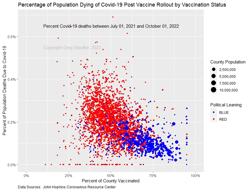
What happens when science & facts are politicized: deaths per unvaccinated patients
submitted 1 year ago by [deleted] from files.catbox.moe
[–]SoCo 15 insightful - 3 fun15 insightful - 2 fun16 insightful - 2 fun16 insightful - 3 fun - 1 year ago (20 children)
As someone who does a ton of data analysis for a living...
This is a purposely terrible choice for a chart. When you can read this chart properly, you can tell the data shows vaccination rates didn't matter much and blue counties weren't as vaccinated as it seems by a glance. This chart style was obviously chosen to make that difficult to tell and make the real data impossible to extract precisely from the melted together blobs.
Some things to remember:
Takeaways:
[–][deleted] 1 year ago (10 children)
[deleted]
[–]iamonlyoneman 2 insightful - 2 fun2 insightful - 1 fun3 insightful - 1 fun3 insightful - 2 fun - 1 year ago (0 children)
Now do a comparison of people who went to hospital after being jabbed vs having seroconverted without the jab.
[–]Dragonerne 2 insightful - 1 fun2 insightful - 0 fun3 insightful - 0 fun3 insightful - 1 fun - 1 year ago (5 children)
Unvaccinated and vaccinated people did not get the same treatment in the hospitals so your statement is nonsense as an argument.
The unvaccinated and vaccinated people are also not randomized, again making the statement nonsense.
Look at overall mortality rate and there's a danish study that says the vaccinated die more often and the pfizer study showed the same.
[–][deleted] 1 year ago (4 children)
[–]Dragonerne 2 insightful - 1 fun2 insightful - 0 fun3 insightful - 0 fun3 insightful - 1 fun - 1 year ago (3 children)
You can't just say false
[–][deleted] 1 year ago (2 children)
[–]Dragonerne 2 insightful - 1 fun2 insightful - 0 fun3 insightful - 0 fun3 insightful - 1 fun - 1 year ago (1 child)
For example, an old person with fluid in his lungs would have been treated in the same manner, regardless of vaccination status.
No, that's not true. They treated them differently based on vaccination status.
They should not be for this particular study of deaths per unvaccinated people.
That doesn't even make sense. Yes it is exactly this type of study where it matters
This is not at issue. The study had to account for old people who were too week to deal with COVID, regardless of vaccination, and consider ALL people who were unvaccinated, by contrast with those who were vaccinated, to assess the number of deaths in each group.
The pfizer study didn't have old people in it
[removed]
[–][deleted] 1 year ago (1 child)
[–]ActuallyNot 2 insightful - 1 fun2 insightful - 0 fun3 insightful - 0 fun3 insightful - 1 fun - 1 year ago* (8 children)
This is a purposely terrible choice for a chart.
I don't see that. It looks like someone uploaded the data into r, and chucked it at ggplot choosing the red and the blue and nothing much else.
The very worst was almost 0.7%, which is pretty significant, a little over 30x what the flu does normally. Although, this is using the inherently inflated emergency counting, which is reasonable for a poor unorganized country that can't do real testing and cause of death examinations, which calls any death with a positive emergency high-false-positive junk test, as being a Covid death.
CoVID deaths are better evidenced that you're claiming. CoVID infection has to cause or contribute to the death.
You see that red line along the bottom, those are all zero's.
The lowest population county is Loving County in Texas, with a population of 64 in 2020. You would expect several of those low population counties to have 0 deaths if the rate is less than 1%.
Those big dots...those are up to 10K times the deaths of those little dots and obscuring if not totally hiding a massive disproportion. Counting deaths or infection rates in per population is always dumb and misleading, but common practice.
Those aren't death rate per population. They're proportion of deaths in the county that are CoVID related, with larger population counties having larger dots.
that solid line of blue dots and one red dot, along the right shows peak vaccination rate's failure.
Funny definition of failure. There's a lower proportion of the deaths due to CoVID than some counties with only 50% vaccination. And as low population counties, you'd be mislead to weight them too highly in considering the correlation between vaccination and death by CoVID.
it appears that blue counties were mostly only between 55%-70% vaccinated,
towards the top of that. Back in January, the rate in Biden Counties was 65%: https://www.kff.org/policy-watch/the-red-blue-divide-in-covid-19-vaccination-rates-continues-an-update/
But the stronger the margin, the greater the vaccination rate: https://www.usnews.com/news/health-news/articles/2022-01-27/counties-that-voted-for-trump-have-lower-covid-vaccination-rates
[–]SoCo 1 insightful - 1 fun1 insightful - 0 fun2 insightful - 0 fun2 insightful - 1 fun - 1 year ago (7 children)
I don't see that. ..
Yes, choosing a ggplot was the very worst possible way to visualize this, but at a glance, it gives the false appearance desired result: "republicans bad"
There is no requirement for COVID to be the cause or contribution to death. These values are just people who had COVID when they died. There is no established way to determine if the death was caused by COVID. That would seem helpful and reasonable, but determining that just isn't realistic and would be a vague judgement call, at best. When a virus obviously causes deaths, but has no direct method to cause death, the best way to have good data of deaths caused by the virus, is to just record all deaths who were infected. This is a common strategy, what is always done, is done with COVID, and the data would likely be worse if we tried to be more specific about COVID deaths, not better.
The lowest population county is...
Yes, but how many of those do you expect to be a population < 100? (not many) I've lived in population 200 townships before, there are many thousands of them in America.
Of course, that is the basics of this chart. I was explaining the result of that. A large dot with a high death/infection rate looks similar to a small dot with a high death/infection rate....but the big dots can be 10,000 times the deaths and infections! This is a huge amount of disparity, and a very important part of information, visually hidden by the way this chart and data is done.
For an arbitrary example: if Cook County, IL (Chicago) had %1 COVID deaths, that would NOT be a smaller deal than Loving County, TX having %50. Yet, we like to talk in percents per population, so we can hide the piles of thousands of dead bodies in larger high population density cities and compare them accusingly to grandma and grandpa dying in a little county's nursing home, giving a higher percent per population.
I'm not sure what you are trying to say. It is a line, because it topped out where the vaccination rate was the highest. This gives you the line of what you could best expect to achieve. This line, shows you what all the rest of the chart is trying to mislead you about; that vaccination rate and political leaning really didn't have much impact on infections and deaths, like this chart was trying to deceive you into thinking. Instead, obviously, population density did, but that is purposely the most obscured aspect of this chart.
towards the top of that. Back in January, the rate in Biden Counties was 65%
So, yeah, many Biden Counties are super low vaccination rates, despite the political rhetoric dividing our country. The deception is that it had anything to do with political ideology and not everything to do with population density.
[–]ActuallyNot 3 insightful - 1 fun3 insightful - 0 fun4 insightful - 0 fun4 insightful - 1 fun - 1 year ago* (6 children)
, it gives the false appearance desired result: "republicans bad"
You don't need a plot for that. Look at their criminality.
These values are just people who had COVID when they died.
Okay. That's bullshit. What made you think that was true?
The deception is that it had anything to do with political ideology and not everything to do with population density.
That's not obvious to me. How did you work that out?
[–]SoCo 1 insightful - 1 fun1 insightful - 0 fun2 insightful - 0 fun2 insightful - 1 fun - 1 year ago (5 children)
People aren't criminals simply for holding and representing constituents who hold political positions you disagree with.
That is expressly the required criteria for those numbers. The CDC tried early on in 2020 to explain this to the public, as it was a common confusion point. It is hard for the public to understand, but like many deadly viruses and diseases, Covid also does not directly kill people. Showing a cause of death is guesswork at best in most cases and especially with comrodities. You are best off counting patients as having "died with Covid", which is what we did and what is a long tested strategy; nothing new.
Some leading causes of death for Covid (old data but makes the point and largely holds true still) {lancet30566-3/fulltext)}:
This chart, while hard to interpret, shows clearly that political ideology has no correlation to infections/deaths. It also strongly shows that this also had no correlation with vaccination rate, albeit the poor chart type hides a lot of data in overlapped and blobbed together dots. While you can find that population density is the main factor in every outside data source you look at, this chart is too unreadable to derive that conclusion from. Yet, with that conclusion from other source, one can look at this garbage chart and confirm that it dose not contradict it and seems to support it. It would help if one could actually reliably tell the size of each dot in the blob.
High population density areas frequently involve a lot of trade shipping, businesses, large airports, and are generally hubs of lots of travel, likely the most important factor, aside from the actual density its self.
[–]ActuallyNot 3 insightful - 1 fun3 insightful - 0 fun4 insightful - 0 fun4 insightful - 1 fun - 1 year ago* (4 children)
That's right. They're criminals for committing crimes.
https://www.motherjones.com/wp-content/uploads/2017/06/blog_convictions_by_administration.gif
That is expressly the required criteria for those numbers.
That's expressly bullshit. Those numbers require Covid to have contributed to the deaths.
You are best off counting patients as having "died with Covid", which is what we did
No you didn't. If someone has a car crash and dies of having their nose pushed into their brain from an airbag, you don't see if they had covid. There are only certain types of death that covid contributes to.
When COVID-19 is reported as a cause of death on the death certificate, it is coded and counted as a death due to COVID-19. COVID-19 should not be reported on the death certificate if it did not cause or contribute to the death.
For fuck's sake, this isn't news SoCo.
Do better.
This chart, while hard to interpret, shows clearly that political ideology has no correlation to infections/deaths.
See how the blue dots are further to the right and the bottom than the red dots?
That shows a correlation between political ideology and both infections/deaths and vaccination rate.
Not as difficult to interpret as you're trying to claim. Also "shows clearly that political ideology has no correlation to infections/deaths" is especially wrong. Beyond "not right" and through the other side to "the opposite of true".
While you can find that population density is the main factor in every outside data source you look at
I see you're confusing correlation and causation. Correlation just means they're related. It doesn't tell you anything about why.
So "population density is correlated to having enough critical thinking skills to get vaccinated and not die of covid" can be true, while "not being a drooling magahat is correlated to having enough critical thinking skills to get vaccinated and not die of covid" can also be true. Both are likely if being a drooling magahat is highly negatively correlated to population density.
And it is. Population density is also correlated to political ideology. You get better education, nutrition and less heavy metals in cities, so you get less conspiracy theories. They're also more cosmopolitan so they generate less racism.
But that's not the only reason. The same media that the neolibs use to get poor people to vote for pro-polluiton, anti-education, anti-services parties, against their own interest, also push anti-vax. It's not obvious why. Maybe they noticed the deaths from covid were higher amongst racial minorities and thought they'd take advantage of letting the disease rip through the population. More likely Trump fuelled a antivax sentiment before he got vaccinated, and they thought that they should make hay from the political divide, now that it was there.
this chart is too unreadable to derive that conclusion from
Now you're backing out your claim that the chart "clearly shows" the opposite of what it shows, and claiming that it's "too unreadable" to show what it does show. That's closer. Still wrong, but no longer the opposite of right. All in the same paragraph.
[–]SoCo 2 insightful - 1 fun2 insightful - 0 fun3 insightful - 0 fun3 insightful - 1 fun - 1 year ago (3 children)
Don't be a jack ass.
Yes, our CDC explained this many times.... as I told you.
Yes, Covid is supposed to be an assumed contributing factor to death when counted, but yes, you simply have to test positive and die, as there is no criteria. Many times there are multiple commodities as well as being elderly in age; It is frequently a very loose judgment call. This is nothing new and a long established as the way to go; it is always better to over-count, than under, in such a situation.
No, that doesn't mean the death counts are inflated, but one does need to understand its context and limitations of accuracy.
Yes, this is very old news for you to just be learning.
Guidance for Certifying Deaths Due to Coronavirus Disease 2019 (COVID–19)
https://www.cdc.gov/nchs/data/nvss/vsrg/vsrg03-508.pdf
(I'm not sure I'll bother with the rest of this conversation, since you came at me like a reddit troll)
[–]ActuallyNot 3 insightful - 1 fun3 insightful - 0 fun4 insightful - 0 fun4 insightful - 1 fun - 1 year ago (2 children)
The data are not people who died with CoVID. They are people whose death was caused or contributed to by CoVID.
Yes, Covid is supposed to be an assumed contributing factor to death when counted,
Correct
but yes, you simply have to test positive and die, as there is no criteria.
Wrong
Many times there are multiple commodities as well as being elderly in age;
It is frequently a very loose judgment call.
Wrong.
This is nothing new and a long established as the way to go; it is always better to over-count, than under, in such a situation.
Wrong. The best is as unbiased as possible.
Most importantly, that the data are not people who died with CoVID. They are people whose death was caused or contributed to by CoVID.
Oh, the irony.
Which backs up (again) what I've been saying.
Your claim that these deaths are anyone who died with CoVID is wrong. Covid had to contribute to the death.
Your take home should be "The data are not people who died with CoVID. They are people whose death was caused or contributed to by CoVID."
[–]SoCo 1 insightful - 1 fun1 insightful - 0 fun2 insightful - 0 fun2 insightful - 1 fun - 1 year ago* (1 child)
I'm sorry you disagree with the CDC and medical norms. I sympathize with your feelings that it would be conforting if there was a more accurate way to tie cause of death to indirect impacts from a viral infection. Sometimes the assumed contribution to death seems pretty obvious, despite no scientifically reliable connection. When we talk about such large events, which so frequently affected the elderly and those with existing medical conditions the most, that distinction is frequently not so clear.
I've been very patient with you, but if I'd like such a emotional conversation using text-book troll moves, I would have stayed on reddit to take the same abuse from the bots and trolls there.
[–]ActuallyNot 4 insightful - 1 fun4 insightful - 0 fun5 insightful - 0 fun5 insightful - 1 fun - 1 year ago* (0 children)
I'm sorry you disagree with the CDC and medical norms
I'm fine with the CDC norms, mate.
I sympathize with your feelings that it would be conforting if there was a more accurate way to tie cause of death to indirect impacts from a viral infection.
You're talking shit.
As per your own link. Patient dies of respiratory distress disorder. Cause of that is the pneumonia. If the infection in the lungs is CoVID, then the underlying cause of the respiratory distress is pneumonia, and the underlying cause of the pneumonia is CoVID. If, on the other hand, something else is infecting the lungs, then it's not CoVID.
In the general and most common case: straightforward. Preferably test for CoVID, but if the symptoms, and exposure to covid are known, its acceptable to assume.
But what you claim, that if someone dies of something unrelated, like a gunshot wound, but has asymptomatic CoVID, then it's a CoVID death, is certainly wrong.
These are not people that died with CoVID. They are people that died of CoVID.
Sometimes the assumed contribution to death seems pretty obvious, despite no scientifically reliable connection
You think the severe respiratory disorder might be independent of the pneumonia, because the patient is elderly?
Ha!
I've been very patient with you
As I have with you. The problem is that you've been wrong.
[–]zyxzevn 5 insightful - 2 fun5 insightful - 1 fun6 insightful - 1 fun6 insightful - 2 fun - 1 year ago* (1 child)
There are no deaths by Covid (99.98% untreated), but deaths by bad treatments (ventilators+ more).
Unvaxxed means not having all boosters in some hospitals, or unknown status. Deaths caused by the vax are counted as Covid deaths (50% of "reported side-effect" was covid). So this chart is fucked up in every way.
The vax also causes a higher chance of getting sick and dying from covid, by its design. It gives the wrong antibodies for variants that no longer exist. Its reduces the natural immunity. And if you have the boosters, your IgG turns into IgG4 which makes the antibodies completely ignore anything that matches (so you die if the variant returns).
Just get the Ivermectin if you are sick. And even Hydroxychloroquine works well in combination with zinc for example. Give 90% to 99% reduction in hospitalization and death if you follow the protocols (which many big-pharma studies did not). There are good treatments listed at http://flccc.net
Remember that science was killed in 2020, with killers like Fauci and Bill Gates.
[–]Feldheld 4 insightful - 1 fun4 insightful - 0 fun5 insightful - 0 fun5 insightful - 1 fun - 1 year ago (3 children)
All cause deaths would be more meaningful. Also it needs to take age distribution into account. If red voters are on average like 10 years older than blue voters they have of course a higher death percentage.
[–]ActuallyNot 3 insightful - 1 fun3 insightful - 0 fun4 insightful - 0 fun4 insightful - 1 fun - 1 year ago (0 children)
There's lots of confounders. Here's another important one: https://pubmed.ncbi.nlm.nih.gov/30688638/
Blue counties tend to have better health care, by being in larger urban centres.
Race is also related to both death rate by CoVID and political leaning.
This chart doesn't tell you about causality. It does tell you that CoVID deaths is related to voting Republican and anti- correlated to vaccination rate.
Both points have been noticed before.
[–]MightyMorphinFaggot 2 insightful - 1 fun2 insightful - 0 fun3 insightful - 0 fun3 insightful - 1 fun - 1 year ago (1 child)
Eh I think the biggest problem is that they don't consider you vaxed until you're dripping 2 weeks later.
The second that shot is in your arm to you should be recorded as vaxed.
[–]Feldheld 2 insightful - 1 fun2 insightful - 0 fun3 insightful - 0 fun3 insightful - 1 fun - 1 year ago (0 children)
Yes. One more reason to count all cause deaths.
[–]Optimus85Independent 3 insightful - 1 fun3 insightful - 0 fun4 insightful - 0 fun4 insightful - 1 fun - 1 year ago (1 child)
Do they write political allegiances on death certificates now? Or does the coroner check the deceased's wallet for a NRA membership card? I'll make sure they put purple on my COD. It's a nice non-polarising colour.
Each dot is a county. They probably used the last presidential election results.
[–]SoCo 15 insightful - 3 fun15 insightful - 2 fun16 insightful - 2 fun16 insightful - 3 fun - (20 children)
[–][deleted] (10 children)
[deleted]
[–]iamonlyoneman 2 insightful - 2 fun2 insightful - 1 fun3 insightful - 1 fun3 insightful - 2 fun - (0 children)
[–]Dragonerne 2 insightful - 1 fun2 insightful - 0 fun3 insightful - 0 fun3 insightful - 1 fun - (5 children)
[–][deleted] (4 children)
[deleted]
[–]Dragonerne 2 insightful - 1 fun2 insightful - 0 fun3 insightful - 0 fun3 insightful - 1 fun - (3 children)
[–][deleted] (2 children)
[deleted]
[–]Dragonerne 2 insightful - 1 fun2 insightful - 0 fun3 insightful - 0 fun3 insightful - 1 fun - (1 child)
[–][deleted] (2 children)
[removed]
[–][deleted] (1 child)
[deleted]
[–]ActuallyNot 2 insightful - 1 fun2 insightful - 0 fun3 insightful - 0 fun3 insightful - 1 fun - (8 children)
[–]SoCo 1 insightful - 1 fun1 insightful - 0 fun2 insightful - 0 fun2 insightful - 1 fun - (7 children)
[–]ActuallyNot 3 insightful - 1 fun3 insightful - 0 fun4 insightful - 0 fun4 insightful - 1 fun - (6 children)
[–]SoCo 1 insightful - 1 fun1 insightful - 0 fun2 insightful - 0 fun2 insightful - 1 fun - (5 children)
[–]ActuallyNot 3 insightful - 1 fun3 insightful - 0 fun4 insightful - 0 fun4 insightful - 1 fun - (4 children)
[–]SoCo 2 insightful - 1 fun2 insightful - 0 fun3 insightful - 0 fun3 insightful - 1 fun - (3 children)
[–]ActuallyNot 3 insightful - 1 fun3 insightful - 0 fun4 insightful - 0 fun4 insightful - 1 fun - (2 children)
[–]SoCo 1 insightful - 1 fun1 insightful - 0 fun2 insightful - 0 fun2 insightful - 1 fun - (1 child)
[–]ActuallyNot 4 insightful - 1 fun4 insightful - 0 fun5 insightful - 0 fun5 insightful - 1 fun - (0 children)
[–]zyxzevn 5 insightful - 2 fun5 insightful - 1 fun6 insightful - 1 fun6 insightful - 2 fun - (1 child)
[–]Feldheld 4 insightful - 1 fun4 insightful - 0 fun5 insightful - 0 fun5 insightful - 1 fun - (3 children)
[–]ActuallyNot 3 insightful - 1 fun3 insightful - 0 fun4 insightful - 0 fun4 insightful - 1 fun - (0 children)
[–]MightyMorphinFaggot 2 insightful - 1 fun2 insightful - 0 fun3 insightful - 0 fun3 insightful - 1 fun - (1 child)
[–]Feldheld 2 insightful - 1 fun2 insightful - 0 fun3 insightful - 0 fun3 insightful - 1 fun - (0 children)
[–]Optimus85Independent 3 insightful - 1 fun3 insightful - 0 fun4 insightful - 0 fun4 insightful - 1 fun - (1 child)
[–]ActuallyNot 3 insightful - 1 fun3 insightful - 0 fun4 insightful - 0 fun4 insightful - 1 fun - (0 children)